LOOK: Cavs unveil modernized logos for 2017-2018 NBA season
A day before their highly anticipated clash with the Golden State Warriors in Game 1 of the 2017 NBA Finals, the Cleveland Cavaliers unveiled a logo makeover for the next season.
The defending champions, as per NBA.com, had worked closely with Nike Inc. to launch five new alternative designs to their existing emblems.
Each of the slick motifs carries a distinct significance for the franchise, embodying the spirit of unity, pride and confidence within the whole Ohio community.
Article continues after this advertisementThe club’s primary logo remains the Cavalier sword, which did not undergo drastic changes.
Photo from Cleveland Cavaliers’ official press release via NBA.com
The logo was described thus: “The sword evokes the spirit of the resilience of Cleveland. Introduced in 2003, the C-Sword is the anchor to the Cavaliers’ brand. It is one of the key symbols of the Cavaliers organization and serves as the iconic image of strength and dedication.”
The partial logo also remains as the letter “C,” which was also redone with minimal changes. The logo has been used at center court of Quicken Loans Arena since 2013.
Article continues after this advertisement
Photo from Cleveland Cavaliers’ official press release via NBA.com
A new secondary logo shows the image of a sturdy shield, which “presents the Cavaliers commitment to Defend the Land.”
Photo from Cleveland Cavaliers’ official press release via NBA.com
A global logo, on the other hand, combines the primary and secondary logos with a smooth-looking black background.
Photo from Cleveland Cavaliers’ official press release via NBA.com
Last but not the least, the new and improved Cavalier word marks “are inspired from notions of a defender and the motion of a sword.”
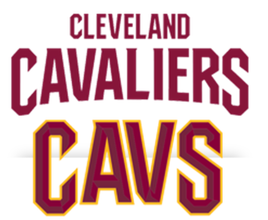
Photo from Cleveland Cavaliers’ official press release via NBA.com
Aside from their logos, the Cavs will debut the Goodyear’s iconic Wingfoot logo in their uniforms next year. Khristian Ibarrola /ra
RELATED STORY:
Cavs the champs but Warriors the favorites in NBA Finals